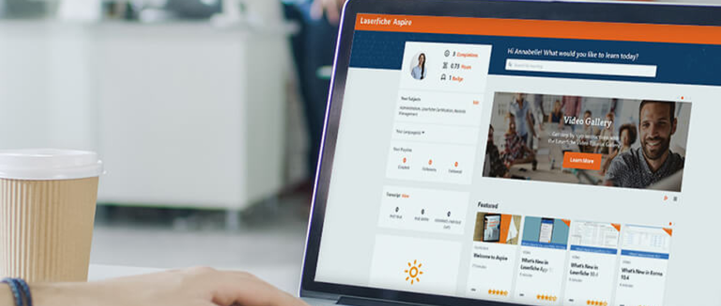
Working with an established brand always brings its own set of challenges but, as our recent work with Laserfiche shows, it can also offer an opportunity to create spectacular results down to the smallest detail.
Following a productive meeting last September, amongst the palms and sunshine surrounding their Long Beach office – two things the Big Bite studio sadly lacks during September – we were proud to be tasked with redesigning and developing the new Laserfiche website. With over 28 years of expertise, 5 million users of their software solutions for business, and offices on three continents, the responsibility of maintaining their instantly recognisable brand was enormous. But working within a strict set of brand guidelines doesn’t have to mean that there’s less scope for creativity, as the finished project shows.
Design by evolution
Our team may not have had free reign to begin designing from a blank canvas but, as any designer will tell you, an established design language doesn’t have to limit the possibility of what can be expressed. Fluent design that remains contemporary is built upon understanding of what came before, not the total rejection of it. There’s always room for improvement and experimentation. Good redesign isn’t destruction and creation. It’s evolution.
The world of software moves quickly, which makes Laserfiche’s status as a leader in the industry for almost three decades all the more impressive. Their site needed a more modern version of their design to reflect that. We began with the instantly recognisable colour scheme: Laserfiche orange, blue and yellow. A bright palette offered the opportunity for a look and structure that’s as easy on the eyes as it is to navigate. Clarity doesn’t have to come at the cost of creativity though. Friendly, even playful, original illustrations draw the eye whilst conveying immediately familiar themes about the benefits of Laserfiche products. Custom-made icons also relay common information with a distinctive voice, all while maintaining Laserfiche’s iconic look.
Working within the established rules of a brand can also encourage creative flourishes in the smallest places. Take the coloured backgrounds of some of the page sections for example. As well as being shaded in variations of Laserfiche orange and blue, the angular motif that runs throughout the site comes from a precise element of the Laserfiche logo, with the angles translated directly from the distinctive edges of the ‘a’ and ‘f’. Whether visitors consciously recognise this or not, it’s another example of how a visual language develops and how design cues can move fluently through the whole site.

Interested in how we create our original illustrations? Read our article A Designer’s Process: From Pencil To Pixel
Building on the past
In much the same way that we weren’t redesigning the site from scratch, our approach to development was more of a spring clean than a fire sale, taking the wealth of data from the old site and building a solid new structure around it. As the structure of the site had been added to over the years it had grown more complex, with elements of the platform built over time and data spread across multiple WordPress installs. Built by different developers, with different processes, the key was to isolate what worked and integrate it into a single, stable foundation.
While performance and simplicity is important in the present, a solid build is also essential for the future of the site. While the site is now standardized for whatever that future may bring, it also boasts a flexible content management system so that Laserfiche can continue to add content with ease. As well as developing with the future in mind, it was also important that the site continues to support all of its active users. For example, support for Internet Explorer 7 and 8 may not be a requirement for many businesses, but there are institutions in the public sector, who also use Laserfiche’s software, where they are still in use. With a truly global user base and offices in Canada, Hong Kong, Mexico, the USA and the UK, it was important that the site also supported localisation for a number of languages. All this had to remain flexible enough to accommodate third party platforms, video, and remain fully mobile optimised and responsive for users accessing the site on devices from desktops to mobile.
Looking for more detail on how we handle development? Read our article Our Process: Opening The Black Box
Final thoughts
With so many considerations in terms of both design and development it would be understandable if our team simply played it safe. That’s not what we do here at Big Bite though. From elegant solutions for the complexity of multiple builds, to an updated design language that takes it cues from the essence of Laserfiche’s brand, our team has injected every little detail with their talent and creativity. We couldn’t be more proud of the result.